☰

November 12, 2026

GFM Painting Logo
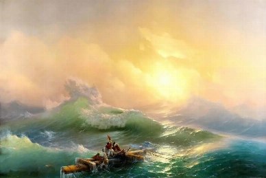
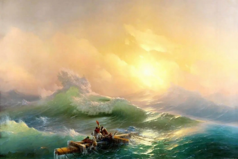
Dramatic seascape painting showing the contrast between a stormy sky and illuminated ocean

Contrast is one of the most powerful tools in seascape painting. Through differences in colour, light, tone, texture and composition, artists can transform a view of the ocean into an expressive scene filled with atmosphere, movement and emotion.

What is contrast in seascape painting?

Contrast in seascape painting refers to the differences between visual elements, such as light and dark, warm and cool colours, calm and turbulent water, or smooth and textured surfaces. These differences help create depth, atmosphere, movement and visual interest.

Why is contrast important in seascapes?

Contrast helps communicate the character and mood of the sea. It can make a peaceful shoreline feel tranquil, a stormy ocean feel powerful, or a distant horizon appear dramatic and mysterious.

How do artists use contrast to express emotion?

Artists use contrasting colours, lighting, textures and compositional elements to guide the viewer's attention and create emotional responses. The relationship between opposing elements can suggest peace, danger, hope, uncertainty or the overwhelming power of nature.

Introduction

The sea is never visually static. Its surface changes constantly as sunlight moves across the water, clouds gather above the horizon and waves rise and fall. Even within a single seascape, an artist can capture remarkable differences between light and darkness, stillness and movement, warmth and coldness.

Contrast gives these differences meaning. Rather than simply recording the appearance of the ocean, artists use opposing visual elements to create atmosphere and communicate ideas. A bright horizon against a dark storm can suggest hope emerging from uncertainty, while gentle waves beside a dramatic sky can create a sense of vulnerability and anticipation.

Understanding contrast allows us to appreciate why certain seascapes feel peaceful, dramatic or emotionally powerful. It also reveals how painters transform the natural world into something deeply personal and expressive.

1. The Visual Context: Why Contrast Is Essential in Seascape Painting

Contrast is fundamental to the way we see and interpret a painting. Without differences between visual elements, a composition can appear flat, indistinct or lacking in direction. In seascapes, contrast helps distinguish the sky from the ocean, foreground waves from distant water, and areas of sunlight from areas of shadow.

The natural environment provides countless opportunities for contrast. A seascape might combine a bright sky with dark water, a quiet beach with powerful waves, or a distant coastline with an expansive open sea. These relationships establish the visual structure of the painting.

Contrast also influences how the viewer experiences the scene. A composition dominated by subtle differences may feel gentle and contemplative. Strong contrasts can introduce tension, movement and drama.

Artists such as J.M.W. Turner explored these possibilities through atmospheric effects, particularly in works such as Snow Storm: Steam-Boat off a Harbour's Mouth (1842). The relationship between the turbulent sea, swirling atmosphere and dramatic light creates an impression of nature's overwhelming force.

Contrast therefore does more than make individual elements visible. It helps establish the identity, atmosphere and emotional direction of the entire seascape.

2. Composition and Structure: Creating Balance Through Opposing Elements

Composition determines how the different elements of a seascape are arranged. Contrast helps artists create a visual relationship between the foreground, middle distance and horizon.

A dark foreground can provide a strong foundation for a lighter sky. Alternatively, a bright area of water can draw the viewer's attention towards the centre of the painting. The placement of contrasting elements creates visual pathways that guide the eye through the scene.

Artists may also use differences in scale and movement. Small, gentle waves in the foreground can be contrasted with larger waves in the distance. A stable coastline may provide a visual counterbalance to the movement of the open sea.

These relationships prevent a painting from feeling visually uniform. Instead, they create rhythm, depth and balance.

A particularly effective example is Ivan Aivazovsky's The Ninth Wave (1850). The dramatic waves and threatening conditions are contrasted with the warm light breaking through the sky. The composition draws the viewer between the danger of the sea and the possibility of survival.

Through careful arrangement, contrast becomes an important part of the storytelling within a seascape.

3. Colour, Light and Atmosphere: Communicating the Mood of the Sea

Colour and light are among the most expressive forms of contrast in seascape painting. The ocean reflects the changing conditions of the atmosphere, meaning that its colours can vary dramatically throughout the day.

Warm colours, including gold, orange and red, can suggest sunrise, sunset and the warmth of sunlight. Cool colours, such as blue, green and violet, may communicate distance, calmness, coldness or uncertainty. When warm and cool colours appear together, they create visual energy and help establish the atmosphere.

Tonal contrast is equally important. The difference between light and dark areas can suggest the direction of sunlight, the depth of the water and the movement of clouds. Strong tonal differences can make a storm appear threatening, while softer transitions can create a peaceful and misty atmosphere.

In seascapes, light often becomes more than a visual feature. It can carry symbolic meaning, suggesting hope, freedom, uncertainty or renewal.

The most effective paintings use colour and light in combination. Rather than simply reproducing the colours of the ocean, artists select and intensify them to communicate a particular experience of the sea.

4. Brushwork, Texture and Surface: Making the Sea Feel Alive

Contrast is not limited to colour and light. The physical application of paint can also create important differences within a seascape. Brushwork and texture help communicate the changing character of water.

Smooth, blended passages may suggest distant water, mist or a calm horizon. In contrast, broken brushstrokes, thicker paint and visible marks can communicate crashing waves, foam and turbulent movement.

The contrast between controlled and expressive brushwork can make the surface of the painting feel more dynamic. Artists may use delicate details in one area and energetic, spontaneous marks in another.

Texture also affects how viewers imagine the physical qualities of the sea. A carefully painted reflection may suggest stillness, while irregular highlights and darker passages can make the water appear restless and unpredictable.

These differences give a seascape a sense of physical presence. They encourage viewers to look beyond the overall composition and appreciate the individual marks and techniques that bring the ocean to life.

5. Symbolism, Emotion and Interpretation: What Contrasting Seas Can Represent

Seascapes often communicate ideas that extend beyond the physical appearance of the ocean. The sea can represent freedom, adventure, uncertainty, danger, isolation or the vastness of nature.

Contrast allows artists to explore these themes visually. A calm section of water beside a turbulent sea might suggest the difference between security and uncertainty. A small vessel surrounded by enormous waves can emphasise human vulnerability in the presence of nature.

Winslow Homer's The Gulf Stream (1899) is a compelling example. The solitary figure aboard a damaged vessel is surrounded by an expansive and threatening ocean. The contrast between the individual and the immense natural environment creates a powerful sense of vulnerability and isolation.

Light can also carry symbolic meaning. A break in the clouds may suggest hope, while an approaching storm can create a feeling of uncertainty or impending danger.

However, the meaning of contrast is not always fixed. Different viewers may interpret the same painting in different ways, depending on their experiences and emotional responses.

This openness to interpretation is one of the reasons why seascapes continue to hold such a strong place in the history of art.

6. Why Contrast Makes Seascapes So Emotionally Powerful

The emotional strength of a seascape often comes from the relationships between its contrasting elements. A painting may be technically accomplished, but it is the interaction of colour, light, composition and texture that can make it memorable.

Strong contrast can create immediate visual impact. It can make a viewer pause, draw attention towards a particular part of the painting and encourage closer examination.

More subtle contrast can produce a different experience. Gentle variations in tone and colour may encourage reflection and create a sense of quiet contemplation.

The relationship between opposing elements also reflects the character of the natural world. The sea can be beautiful and threatening, peaceful and powerful, familiar and mysterious. A successful seascape captures these contradictions rather than presenting the ocean as a single, unchanging subject.

Ultimately, contrast allows artists to move beyond representation. It gives them the means to express their personal interpretation of the sea and to create paintings that connect with viewers on both visual and emotional levels.

Conclusion

Contrast plays a central role in shaping the meaning and emotional impact of seascape paintings. Through differences in colour, light, tone, composition and texture, artists create depth, movement and atmosphere.

From the dramatic skies of J.M.W. Turner to the powerful waves of Ivan Aivazovsky and the human vulnerability explored by Winslow Homer, artists have used contrast to communicate different experiences of the ocean.

When viewing a seascape, it is worth looking beyond the subject itself. Consider where the strongest contrasts appear, how light interacts with the water, and how opposing elements influence the mood of the painting.

These details reveal how artists transform the ever-changing sea into a meaningful and expressive work of art.

The Art of Contrast: Exploring Light, Colour and Emotion in Seascape Paintings

Contrast is one of the most powerful elements in seascape painting. Through the interplay of light and darkness, colour, texture and composition, artists transform the ocean into an expressive visual experience.

From peaceful shorelines to turbulent stormy waters, contrasting elements help communicate the changing moods and unpredictable character of the sea.

Artists such as J.M.W. Turner, Ivan Aivazovsky and Winslow Homer used contrast to create dramatic compositions, explore human emotions and capture the overwhelming power of nature.

The relationship between light and shadow, warm and cool colours, and calm and turbulent waters can reveal deeper meanings within a painting.

Discover how contrast shapes the atmosphere, visual impact and emotional interpretation of some of the most fascinating seascape paintings in art history.

FAQ

Frequently Asked Questions

What is contrast in seascape painting?

Contrast in seascape painting refers to the differences between visual elements such as light and darkness, warm and cool colours, smooth and textured surfaces, and calm and turbulent water. Artists use these differences to create depth, atmosphere, movement and visual interest.

Why is contrast important in seascape art?

Contrast helps bring a seascape to life by creating visual depth and establishing the mood of the painting. It allows artists to highlight particular areas, distinguish the sky from the ocean and communicate the changing conditions of the sea, from peaceful coastal scenes to dramatic storms.

How do artists use light and shadow in seascape paintings?

Artists use light and shadow to create atmosphere, depth and a sense of movement. Bright sunlight reflecting across the water can suggest tranquillity and warmth, while dark clouds and deep shadows can introduce tension, mystery or the approaching threat of a storm.

How does colour contrast affect the mood of a seascape?

Colour contrast influences how viewers emotionally respond to a seascape. Warm colours such as gold, orange and red can suggest sunlight, warmth and optimism, while cooler blues, greens and violets can communicate distance, calmness or uncertainty. Combining warm and cool colours creates visual energy and atmosphere.

What is the difference between tonal contrast and colour contrast?

Tonal contrast refers to the difference between light and dark values within a painting, whereas colour contrast describes the visual differences between colours. Artists combine both techniques to create depth, emphasise important details and establish the overall atmosphere of a seascape.

How does brushwork create contrast in ocean paintings?

Brushwork creates contrast through variations in the application and texture of paint. Smooth, blended brushstrokes can represent distant water or calm seas, while energetic, broken strokes and thicker applications of paint can suggest crashing waves, sea foam and turbulent conditions.

Which famous artists used contrast in their seascape paintings?

J.M.W. Turner, Ivan Aivazovsky and Winslow Homer are notable artists who explored contrast in their seascapes. Turner used atmospheric light and dramatic weather, Aivazovsky portrayed the power of waves and illuminated skies, while Homer explored the relationship between human vulnerability and the vast ocean.

How does contrast communicate emotion and symbolism in seascape art?

Contrasting elements can communicate ideas such as hope, danger, freedom, isolation and uncertainty. For example, a bright horizon emerging from a dark storm may suggest hope, while a small vessel surrounded by enormous waves can symbolise human vulnerability in the face of nature.

Can contrast make a seascape painting appear more realistic?

Yes. The careful use of tonal differences, colour relationships, reflections and surface textures can help create a convincing representation of the sea. Contrast also helps establish perspective, distinguish foreground and background elements, and recreate the changing effects of natural light.

What should I look for when appreciating contrast in a seascape painting?

Begin by observing the relationship between the lightest and darkest areas of the painting. Look at how the artist combines warm and cool colours, smooth and textured brushwork, and calm and turbulent water. Consider how these contrasting elements guide your attention and influence the atmosphere and emotional meaning of the artwork.

Can't Find What You Are Looking For

Contact Us

Sign up to receive the latest news from GFM Painting via email, including exclusive offers and updates...

PORTRAIT & REPRODUCTION
| | | |
PORTRAIT & REPRODUCTION
Show prices in

GFM Designer Ltd
Maultway Court
67-69 Ruxley Lane
Epsom, Surrey
KT19 0JG. UK
E-MAIL : info@gfmpainting.co.uk
PHONE : +44 (0) 203 592 3482
MOBILE : +44(0) 7834 393 396

  • Copyright GFM Designer 2026
  • Company Registration : 07286936
| | | |
GFM Painting top
GFM Painting