☰

November 12, 2026

GFM Painting Logo
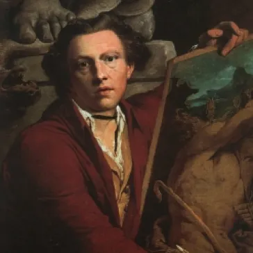
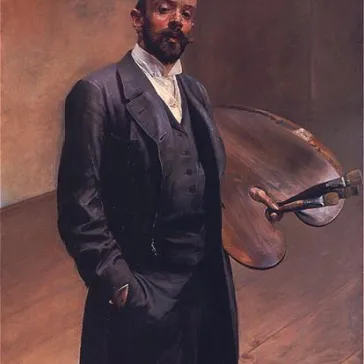
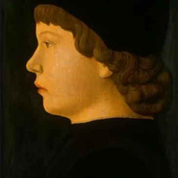
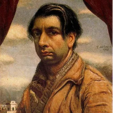
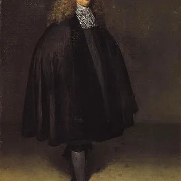
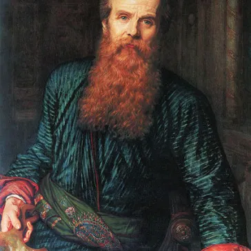
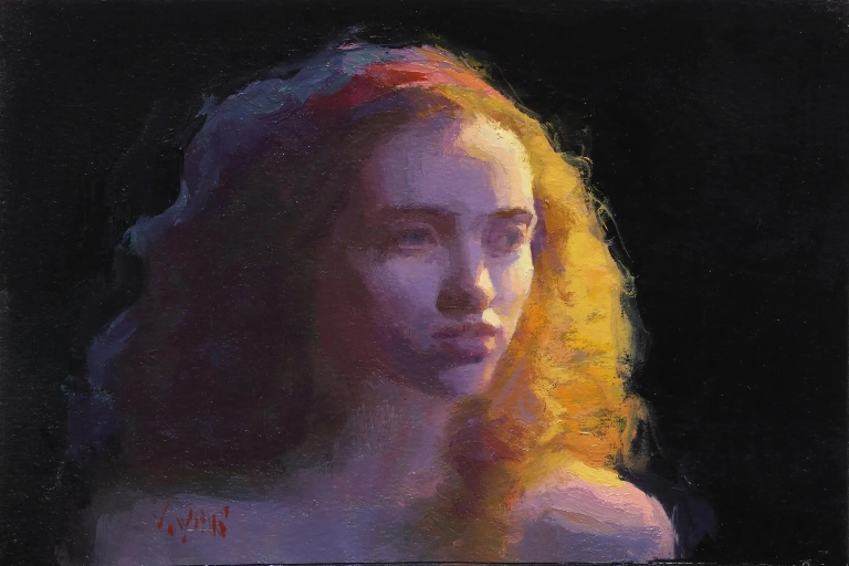
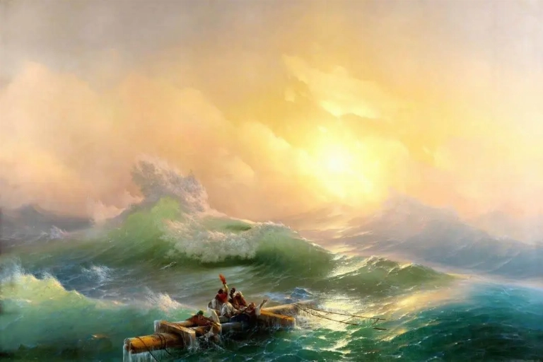
Expressive portrait painting illustrating the use of warm and cool colours, light and shadow to communicate human emotion and identity.

Colour is one of the most expressive elements in portrait painting. Beyond representing the appearance of a person, colour can communicate personality, emotion, identity, status and cultural meaning. The choices an artist makes about skin tones, clothing, backgrounds and surrounding details can influence how viewers understand and respond to a portrait.

What does colour represent in portrait painting?

Colour in portrait painting can represent personality, emotion, identity, social status and cultural background. Artists use colour in clothing, skin tones, backgrounds and surrounding objects to communicate meaning and influence how viewers interpret the subject.

How does colour influence the mood of a portrait?

Colour influences mood through its temperature, intensity and relationships. Warm colours can create feelings of intimacy, energy and optimism, while cooler colours may suggest calmness, distance, reflection or melancholy. Strong colour contrasts can introduce drama and visual tension.

Why is colour important when painting a portrait?

Colour is important because it helps establish the atmosphere, visual balance and emotional character of a portrait. It also allows artists to create realistic skin tones, emphasise particular features, communicate symbolic ideas and express their personal interpretation of the subject.

Introduction

A portrait is more than a representation of someone's face. It is an interpretation of an individual, shaped by the artist's understanding of character, emotion and identity. While facial expression, posture and composition are important, colour plays an equally significant role in determining how a portrait communicates with its audience.

The colours surrounding a person can influence our perception before we have examined the finer details. A portrait featuring soft, warm tones may feel welcoming and intimate, whereas a composition dominated by dark, cool colours might create a more serious or contemplative atmosphere.

Skin tones also require careful consideration. Human skin contains a complex combination of colours influenced by lighting, environment, reflection and the artist's chosen palette. Representing these variations successfully requires more than simply selecting a colour that appears similar to the subject's complexion.

Throughout art history, painters have used colour both realistically and symbolically. Some have pursued subtle naturalism, while others have deliberately intensified colours to communicate psychological states, personal identity or emotional experiences.

By examining the relationship between colour and portraiture, we can better understand how artists create paintings that communicate far more than physical appearance.

1. Colour and Identity: Representing the Individual Beyond Physical Appearance

Colour plays an important role in establishing the identity of the person portrayed. Although facial features provide the immediate recognition of an individual, the surrounding palette can reveal additional aspects of their personality, background and character.

Clothing is particularly significant. The colours selected for a subject's garments can communicate wealth, occupation, cultural traditions, religious associations or social position. Historically, certain pigments were expensive and difficult to obtain, making particular colours symbols of privilege and status.

For example, rich reds and blues were frequently associated with wealth and importance in European portraiture. The use of luxurious fabrics and carefully selected colours could communicate the social standing of the individual being portrayed.

Background colours also contribute to identity. A dark, understated background can direct attention towards the subject's face, while a colourful environment may communicate something about their interests, surroundings or personal circumstances.

Artists sometimes move beyond realistic colour to create a more individual interpretation. Instead of reproducing every detail exactly as it appears, they select colours that reflect how they perceive the person.

This distinction is important because portraiture is not simply about copying physical appearance. It involves making artistic decisions that determine how an individual will be represented and remembered.

Colour therefore becomes part of the visual language through which an artist communicates identity.

2. Warm and Cool Colours: Creating Emotional Atmosphere

One of the most effective ways artists shape the emotional character of a portrait is through the relationship between warm and cool colours.

Warm colours include reds, oranges and yellows. These colours are often associated with energy, warmth, passion and intimacy. When used carefully, they can create a sense of closeness between the subject and the viewer.

Cool colours include blues, greens and violets. They are frequently associated with calmness, reflection, distance and melancholy. In portrait painting, these colours can create a quieter atmosphere or introduce a sense of psychological depth.

However, colour associations are not universal. Their meaning depends on the surrounding colours, cultural context, subject matter and the artist's intention.

The interaction between warm and cool tones is particularly important when painting skin. A face may contain warm highlights alongside cooler shadows, creating a convincing sense of depth and volume.

An artist might use warmer tones around the cheeks, forehead and areas receiving direct light, while cooler colours help describe shadowed areas. These variations prevent the face from appearing flat or artificially uniform.

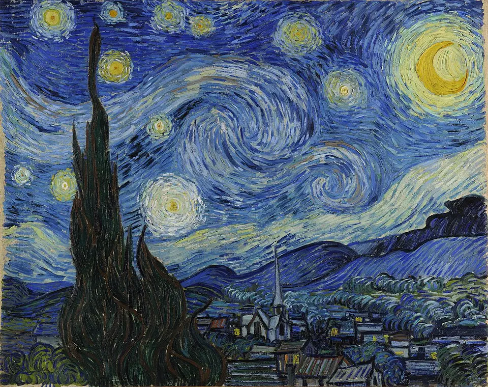
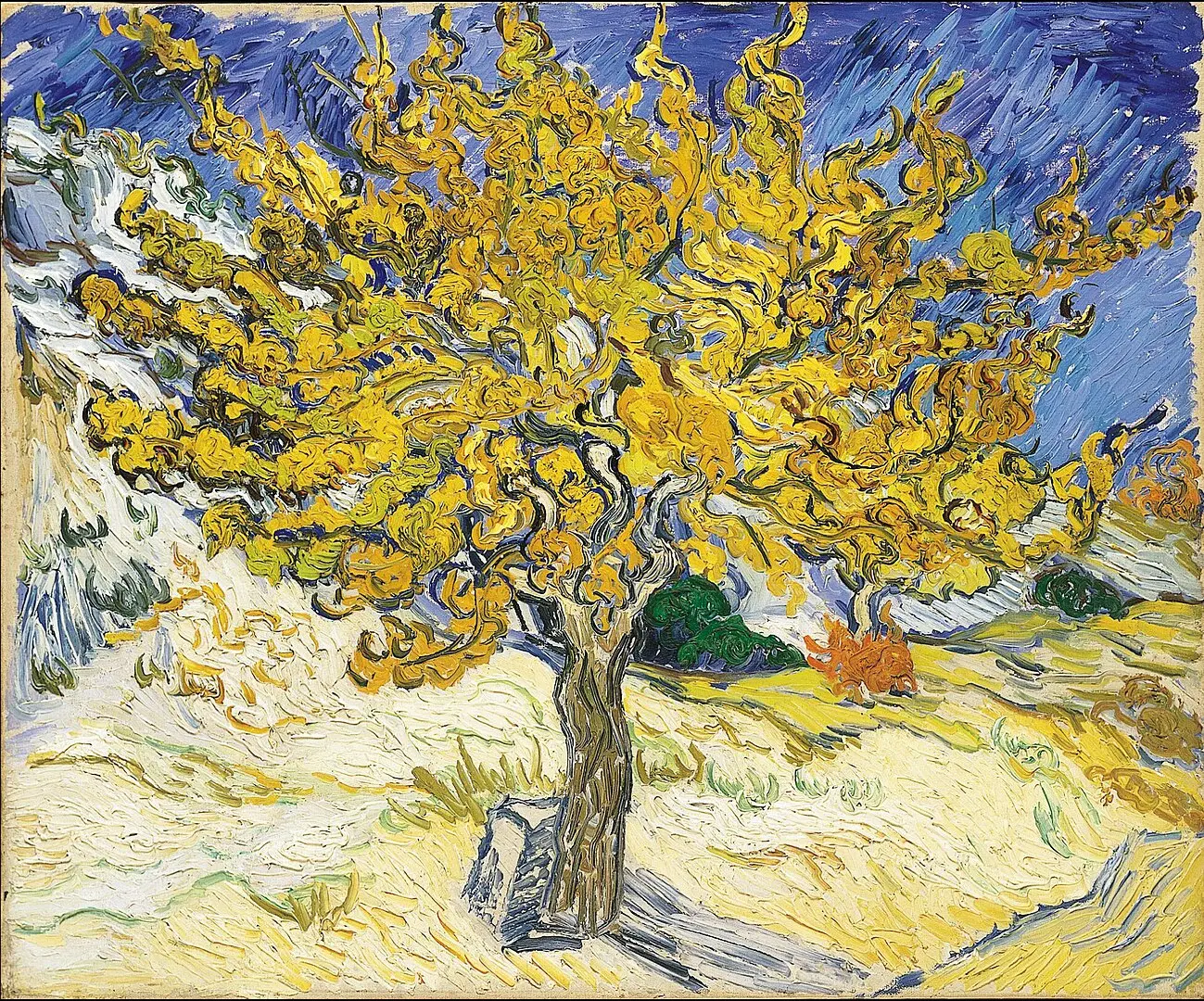
Vincent van Gogh explored expressive colour relationships in his portraits. Rather than relying entirely on naturalistic representation, he used strong colours and energetic brushwork to communicate psychological intensity and individual character.

His portraits demonstrate that colour can become an expressive tool in its own right, allowing artists to communicate emotional qualities that may not be immediately visible through facial expression.

3. Skin Tones, Light and Shadow: The Complexity of Human Colour

Representing human skin is one of the most challenging aspects of portrait painting. Skin is not a single, uniform colour. Its appearance changes according to lighting conditions, surrounding objects, reflected light and the natural variations present across the face and body.

An artist must consider how these factors influence the overall colour relationships within the portrait.

Under warm lighting, skin may appear more golden, orange or reddish. Under cooler lighting, the same complexion may take on blue, violet or greenish undertones. These changes are not necessarily changes in the person's natural complexion; they are often the result of environmental lighting.

Light and shadow also affect how we perceive facial structure. Lighter areas help describe the forehead, cheekbones and nose, while darker areas establish depth around the eyes, beneath the nose and along the jawline.

However, successful portrait painting requires more than creating highlights and shadows. Artists must understand the subtle transitions between colours.

A shadow is not simply a darker version of the skin colour. It may contain reflected colours from clothing, the surrounding environment or nearby objects. Similarly, highlights may contain warm or cool variations depending on the light source.

Leonardo da Vinci demonstrated remarkable sensitivity to these transitions through his use of sfumato, a painting technique involving subtle gradations between tones and colours.

In the Mona Lisa, the delicate transitions across the face create a soft, natural appearance. Rather than relying on sharply defined outlines, Leonardo allowed forms to emerge through gradual changes in light and shade.

This approach demonstrates how sophisticated colour relationships can create realism, depth and a convincing sense of human presence.

4. Colour Symbolism: Communicating Ideas Beyond the Portrait

Throughout art history, colour has carried symbolic meanings that extend beyond its visual appearance. Artists have used particular colours to communicate religious beliefs, cultural values, political associations, social position and personal experiences.

Red, for example, has been associated with passion, power, love and danger. Blue has frequently been connected with spirituality, dignity and contemplation. White may represent purity or innocence in certain cultural traditions, while black can communicate authority, mourning or mystery.

These associations depend heavily on historical and cultural context. A colour that represents celebration in one tradition may carry a very different meaning in another.

In portraiture, symbolism can appear through clothing, accessories, backgrounds and surrounding objects. A particular garment may indicate social status, while the colours used in the background may reinforce the emotional or symbolic message of the painting.

Frida Kahlo's self-portraits provide an interesting example of how colour can contribute to personal identity and symbolism.

Her paintings frequently combine vivid colours, carefully selected clothing, natural imagery and symbolic objects. These elements create complex visual narratives connected to her personal experiences, cultural identity and understanding of herself.

Her work demonstrates that colour does not need to remain within the boundaries of physical representation. It can communicate ideas, memories and experiences that are difficult to express through facial features alone.

When interpreting a portrait, therefore, it is worth considering not only which colours are present but also why the artist might have selected them.

5. Colour, Composition and Visual Focus: Guiding the Viewer's Attention

Colour is also an important compositional tool. Artists use differences in brightness, saturation and temperature to control where viewers look and how they move through a painting.

A brightly coloured face against a darker background immediately attracts attention. Similarly, a distinctive garment or colourful object can become a focal point within the composition.

The relationship between the subject and the background is particularly important. If both contain similar colours and tonal values, the subject may appear to merge with the surrounding environment. Introducing carefully controlled contrast can help separate the figure and create a clearer sense of depth.

Colour saturation also influences visual emphasis. Highly saturated colours tend to attract attention, while muted colours can create a quieter supporting environment.

Artists must balance these relationships carefully. If every area of a portrait contains equally intense colours, the composition may become visually overwhelming. Selective use of strong colour allows particular features to become more prominent.

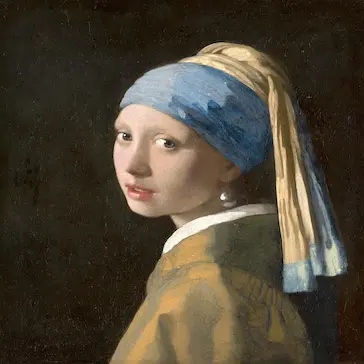
Johannes Vermeer demonstrated exceptional control of colour and light in his paintings. In works such as Girl with a Pearl Earring, the relationship between the subject's clothing, skin tones, head covering and dark background creates a striking visual arrangement.

The limited composition allows the viewer to concentrate on the face and expression, while the carefully balanced colours contribute to the painting's atmosphere.

This illustrates how colour can organise a portrait as well as communicate its emotional meaning.

6. The Artist's Personal Palette: Colour as an Expression of Artistic Style

Every artist develops an individual approach to colour. Some prefer subtle, naturalistic palettes, while others use intense colours, unusual combinations and expressive brushwork.

These preferences become part of an artist's recognisable visual identity.

A restrained palette can create a sense of harmony and timelessness. Subtle variations between similar colours may encourage viewers to concentrate on facial expression, posture and character.

By contrast, a more expressive palette can communicate emotion through deliberate exaggeration. An artist might use unexpected colours in the background, clothing or even the face to create tension or emphasise a particular psychological quality.

The choice of palette also reflects the artistic movement and historical period in which a painter worked. Renaissance artists often pursued balanced colour relationships and naturalistic representation, while later movements explored greater freedom in the use of colour.

Modern portrait artists continue to experiment with these possibilities, combining traditional techniques with contemporary interpretations of identity and self-expression.

Ultimately, there is no single correct palette for portrait painting. The most effective approach depends on the subject, the intended atmosphere and the artist's creative vision.

A successful portrait uses colour purposefully, ensuring that every choice contributes to the overall experience of the painting.

Conclusion

Colour is fundamental to the meaning and emotional impact of portraiture. It influences how we perceive an individual's identity, character and surroundings, while also establishing the atmosphere and visual structure of the painting.

Through warm and cool relationships, subtle skin tones, dramatic contrasts and symbolic choices, artists communicate ideas that extend far beyond physical appearance.

The works of Leonardo da Vinci, Johannes Vermeer, Vincent van Gogh and Frida Kahlo demonstrate the many ways colour can be used to create realism, express emotion and communicate personal identity.

When looking at a portrait, consider how the artist has selected and combined colours. Notice the relationship between the face, clothing and background, and consider how light and shadow influence the subject's appearance.

These details reveal that colour is not simply a decorative element. It is an essential part of the visual language of portraiture, helping transform the representation of an individual into a meaningful work of art.

Beyond the Canvas: The Colours That Reveal Human Identity

Colour is one of the most powerful elements in portrait painting. Beyond capturing a person's physical appearance, artists use colour to communicate personality, emotion, identity and individuality.

From subtle skin tones and warm highlights to dramatic shadows and expressive backgrounds, every colour choice can influence how we perceive a portrait.

Throughout art history, artists such as Leonardo da Vinci, Johannes Vermeer, Vincent van Gogh and Frida Kahlo have demonstrated how colour can transform a painted portrait into a meaningful expression of human experience.

Discover how warm and cool colours, light and shadow, colour symbolism and artistic palettes shape the atmosphere and emotional meaning of portrait paintings.

Explore the relationship between colour and identity, and understand how artists use their palettes to bring portraits to life.

FAQ

Frequently Asked Questions

What is the importance of colour in portrait painting?

Colour helps artists communicate personality, emotion, identity and atmosphere. Through the careful selection of skin tones, clothing colours and backgrounds, artists can create portraits that reveal more than a person's physical appearance.

How do colours influence emotions in portrait paintings?

Colours can influence the emotional response of the viewer. Warm colours such as red, orange and yellow can suggest warmth, passion and energy, while cooler colours such as blue, green and violet may communicate calmness, reflection or melancholy. Their meaning also depends on the context of the painting.

How do artists choose the right colours for a portrait?

Artists consider the subject's natural colouring, lighting conditions, background, clothing and intended atmosphere. They also consider how different colours interact to create harmony, contrast, depth and visual balance.

Why are skin tones important in portrait painting?

Skin tones are essential for creating a convincing representation of a person. Artists combine different warm and cool colours to capture natural variations in complexion, light and shadow. Subtle colour transitions help give the face depth, dimension and realism.

What is the difference between warm and cool colours in portraiture?

Warm colours include reds, oranges and yellows, while cool colours include blues, greens and violets. Warm colours can create an intimate or energetic atmosphere, whereas cool colours may produce a calmer or more reflective mood. Artists frequently combine both to create depth and visual interest.

How does light and shadow affect colour in portrait painting?

Light and shadow influence the appearance of colours across the face and surrounding environment. Direct light can create brighter highlights, while shadows introduce darker and sometimes cooler tones. Artists use these variations to establish facial structure, depth and realistic lighting.

Which famous artists are known for their use of colour in portraiture?

Leonardo da Vinci, Johannes Vermeer, Vincent van Gogh and Frida Kahlo are notable examples. Leonardo explored subtle colour transitions, Vermeer used carefully balanced colours and light, Van Gogh experimented with expressive colour relationships, and Kahlo incorporated vivid colours and symbolism into her self-portraits.

What is colour symbolism in portrait painting?

Colour symbolism involves using particular colours to communicate ideas, emotions or cultural meanings beyond their physical appearance. For example, red may represent passion or power, blue may suggest spirituality or dignity, and white may symbolise purity in certain cultural traditions. Interpretations vary according to historical and cultural context.

How does background colour influence a portrait?

Background colour helps establish the atmosphere and visual focus of a portrait. A dark background can make the subject's face stand out, while a lighter or more colourful background can introduce a different mood or provide information about the person's surroundings and identity.

Can colour influence the artistic style of a portrait?

Yes. An artist's choice of palette is an important part of their individual artistic style. Some painters favour subtle, realistic colours, while others use bold, exaggerated or unexpected combinations to communicate emotion and personal expression. These choices help make each artist's portraiture distinctive.

Can't Find What You Are Looking For

Contact Us

Sign up to receive the latest news from GFM Painting via email, including exclusive offers and updates...

PORTRAIT & REPRODUCTION
| | | |
PORTRAIT & REPRODUCTION
Show prices in

GFM Designer Ltd
Maultway Court
67-69 Ruxley Lane
Epsom, Surrey
KT19 0JG. UK
E-MAIL : info@gfmpainting.co.uk
PHONE : +44 (0) 203 592 3482
MOBILE : +44(0) 7834 393 396

  • Copyright GFM Designer 2026
  • Company Registration : 07286936
| | | |
GFM Painting top
GFM Painting