☰

November 12, 2026

GFM Painting Logo
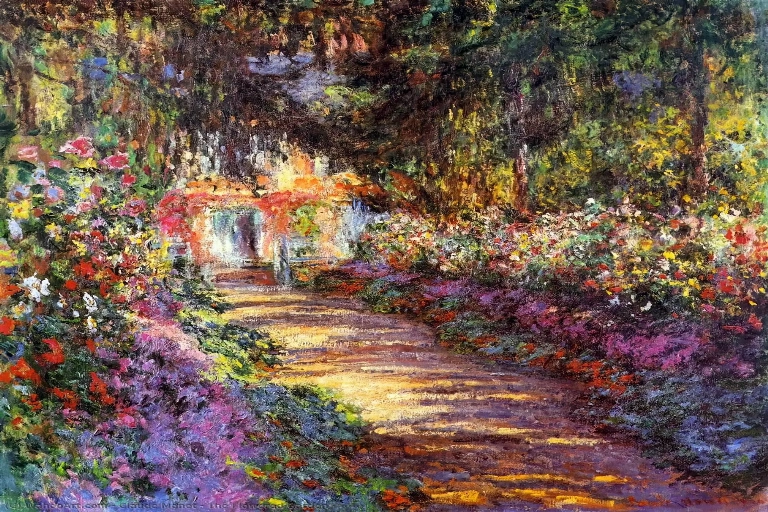
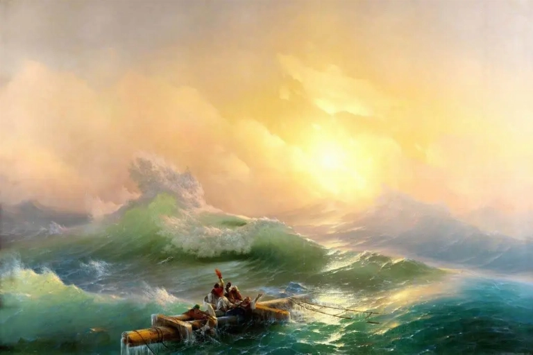
Impressionist landscape painting illustrating the expressive use of warm and cool colours, natural light and atmospheric perspective.

Colour is one of the most powerful tools in landscape painting. It does far more than reproduce the appearance of nature; it communicates atmosphere, creates depth, establishes mood and influences how viewers interpret a scene. From the golden warmth of a summer sunset to the cool blues of a mist-covered mountain, artists use colour to transform landscapes into expressive works of art.

What does colour represent in landscape painting?

Colour in landscape painting represents the natural environment while also communicating mood, atmosphere, season and emotion. Artists use different hues, tones and contrasts to express how they experience and interpret a particular place.

How does colour influence the mood of a landscape painting?

Colour influences mood through its temperature, intensity and relationship with light. Warm colours can suggest energy, comfort and optimism, while cool colours may create feelings of calm, distance or melancholy. Subtle changes in colour can transform the emotional character of an entire landscape.

Why is colour important in landscape painting?

Colour is important because it helps artists create atmosphere, establish visual balance, suggest distance and communicate meaning. It allows a landscape to become more than a realistic representation of nature by expressing the artist's personal response to the environment.

Introduction: Seeing the Landscape Through Colour

Landscape painting has long provided artists with an opportunity to explore the relationship between nature, light and human emotion. Although the subject may be a familiar countryside, mountain range, river or coastline, the artist's choice of colour can produce an entirely different interpretation of the same environment.

Natural landscapes are constantly changing. The colours of trees, fields, mountains and skies are influenced by the time of day, weather conditions, seasons and the quality of light. Artists observe these changes and translate them into carefully considered colour relationships.

Some painters pursue the subtle colours of nature, while others deliberately exaggerate or transform them to communicate emotion and personal expression. The result is that colour becomes both a descriptive and expressive element of landscape art.

1. Colour and Nature: Representing the Changing Landscape

Nature provides an extraordinary range of colours, from the delicate greens of spring to the rich reds and golds of autumn. Artists use these variations to communicate the character of a landscape and establish its seasonal identity.

Seasonal changes offer particularly clear examples of how colour influences landscape painting:

  • Spring: Fresh greens, soft yellows and delicate pinks can suggest renewal, growth and the return of life.
  • Summer: Rich greens, bright blues and warm golden tones often communicate abundance, warmth and vitality.
  • Autumn: Deep reds, oranges, browns and golden yellows create a sense of richness, transition and reflection.
  • Winter: Muted greys, whites, pale blues and subdued browns can convey stillness, isolation and quiet beauty.

However, artists do not simply copy the colours they see. They interpret them according to their artistic intentions, sometimes intensifying or simplifying natural colours to create a particular visual effect.

Claude Monet provides an important example of this approach. Rather than treating a subject as having one fixed appearance, Monet repeatedly painted the same subjects under different lighting and atmospheric conditions. His series of haystacks, poplars and Rouen Cathedral demonstrate how changing light can transform the colours and appearance of a landscape.

His work reveals that a landscape is not simply defined by its physical features. Its visual identity can change dramatically according to the time of day, weather and surrounding atmosphere.

2. Warm and Cool Colours: Creating Atmosphere and Emotion

One of the most effective ways artists influence the atmosphere of a landscape is through the relationship between warm and cool colours. These colour temperatures can create emotional associations while also helping to establish visual depth.

Warm colours commonly include:

  • Red and orange, which can communicate energy, intensity and warmth.
  • Yellow and gold, which may suggest sunlight, optimism and brightness.
  • Warm browns and ochres, which can create a feeling of earthiness and stability.

Cool colours commonly include:

  • Blue, which can suggest calmness, distance and tranquillity.
  • Green, which can communicate natural growth, freshness and balance.
  • Violet and blue-grey, which can create atmosphere, mystery and introspection.

Artists can use these relationships in several ways:

  1. Establishing emotional atmosphere: Warm colours can make a landscape feel welcoming and energetic, while cool colours can create a quieter or more reflective mood.
  2. Creating visual contrast: Placing warm and cool colours together can make particular areas of a composition stand out.
  3. Suggesting distance: Warmer colours are often used in foreground elements, while cooler and less intense colours can help distant mountains and other features appear further away.

Vincent van Gogh's Olive Trees (1889) demonstrates how expressive colour can transform a natural subject. His distinctive use of blues, greens and contrasting tones gives the landscape an energetic quality, communicating more than the physical appearance of the trees and surrounding environment.

Through colour, Van Gogh creates a landscape that feels personal and emotionally charged rather than simply descriptive.

3. Light, Shadow and Colour: Capturing the Atmosphere of Nature

Light plays a fundamental role in determining how colour appears within a landscape. The same location can look dramatically different at sunrise, midday, sunset or under an overcast sky. Artists study these changes to capture the atmosphere and character of a particular moment.

Different lighting conditions can produce distinct visual effects:

  • Sunrise: Soft pinks, pale yellows and gentle orange tones can create a feeling of freshness and anticipation.
  • Midday: Strong sunlight often produces brighter colours, sharper contrasts and more defined shadows.
  • Sunset: Deep oranges, reds, purples and golden tones can create dramatic and emotionally expressive compositions.
  • Overcast conditions: Muted colours and softer contrasts can communicate quietness, melancholy or tranquillity.
  • Fog and mist: Reduced contrast and subdued colours can create mystery and a sense of atmospheric distance.

Shadows are equally important. They are not simply areas where light is absent; they contain colour and contribute to the overall harmony of a painting.

Artists may use shadows to:

  1. Establish the direction and intensity of light.
  2. Strengthen the contrast between illuminated and shaded areas.
  3. Create depth and visual structure.
  4. Introduce cooler or warmer colour relationships.

J. M. W. Turner's Buttermere Lake, with Part of Cromackwater, Cumberland, a Shower (1798) demonstrates the expressive potential of light and atmosphere in landscape painting. His treatment of the sky, water and changing weather illustrates how natural light can become a central element of the composition.

Turner's approach shows that atmospheric conditions can be just as important as the landscape itself. Light and colour work together to communicate the experience of being within a particular natural environment.

4. Colour Symbolism: Communicating Ideas Beyond the Natural Scene

Colour can also carry symbolic meaning in landscape painting. Beyond describing trees, skies, mountains and water, artists may use particular colours to suggest ideas, emotions or deeper interpretations of the natural world.

Some common symbolic associations include:

  • Green: Growth, renewal, fertility and harmony with nature.
  • Blue: Peace, contemplation, distance and spirituality.
  • Red: Passion, danger, energy and transformation.
  • Yellow: Light, hope, warmth and optimism.
  • White: Purity, simplicity, stillness and sometimes isolation.
  • Black and dark tones: Mystery, uncertainty, drama and emotional intensity.

These meanings are not universal rules. Symbolism depends on the artist's intentions, cultural background, historical period and the wider context of the painting.

The Symbolist movement demonstrated how artists could move beyond straightforward representation to explore ideas, imagination and emotional experience. In this broader artistic tradition, colour became a means of communicating meanings that might not be immediately visible within the subject itself.

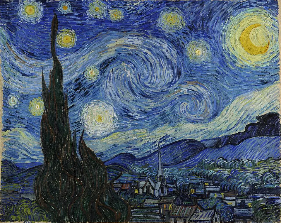
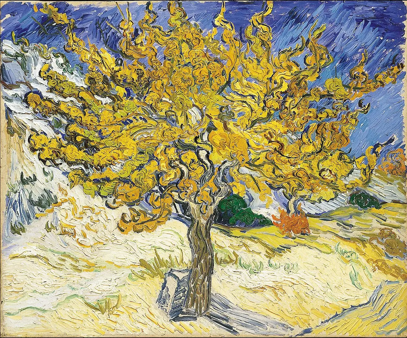
Van Gogh's landscapes also illustrate how colour can become an expression of personal experience. His vivid and sometimes unconventional colour choices communicate emotional intensity and a distinctive interpretation of the natural world.

Through symbolic colour, a landscape can suggest themes such as renewal, solitude, hope, uncertainty or the relationship between humanity and nature.

5. Colour, Composition and Perspective: Creating Depth and Visual Balance

Colour contributes significantly to the way viewers understand the structure of a landscape painting. Artists use colour relationships to guide the eye, establish focal points and create the illusion of distance on a flat surface.

Several techniques help create depth and perspective:

  1. Colour temperature: Warmer colours can attract attention in the foreground, while cooler colours often help distant elements appear further away.
  2. Colour intensity: Stronger, more saturated colours can make foreground objects appear prominent, while muted colours can suggest distance.
  3. Atmospheric perspective: Distant mountains and landscapes often appear lighter, cooler and less detailed because of atmospheric conditions.
  4. Colour contrast: Differences in brightness, temperature and intensity can separate objects and create a stronger sense of visual structure.

Colour also helps establish balance within a composition. A large area of one colour may be balanced by smaller areas of contrasting colour elsewhere in the painting. Artists carefully consider these relationships to create harmony without making the composition feel static.

Paul Cézanne's paintings of Mont Sainte-Victoire demonstrate how colour can help construct the landscape. Rather than relying exclusively on traditional linear perspective, Cézanne used carefully organised colour relationships and distinct brushstrokes to communicate the structure and form of the natural environment.

His approach influenced the development of modern art by demonstrating that colour could be used not only to describe objects but also to organise the entire composition.

6. The Artist's Personal Palette: Colour as an Expression of Artistic Style

Every artist develops an individual approach to colour. Their palette may be influenced by personal experience, artistic training, cultural background, the environment in which they work and the emotional qualities they wish to communicate.

Several influential landscape artists demonstrate how distinctive colour choices can shape an artistic identity.

  • Claude Monet: Associated with Impressionism, Monet explored the changing effects of natural light through subtle colour variations and repeated studies of the same subjects.
  • J. M. W. Turner: Known for atmospheric landscapes in which light, colour and weather often become dominant features of the composition.
  • Vincent van Gogh: Used expressive, energetic colour combinations and distinctive brushwork to communicate personal interpretations of the landscape.
  • Paul Cézanne: Used carefully structured colour relationships to explore form, depth and the underlying organisation of nature.

An artist's personal palette can be recognised through several characteristics:

  • Preference for particular colour families, such as earthy greens, blues or warm ochres.
  • The balance between naturalistic and expressive colour.
  • Use of strong contrasts or subtle tonal transitions.
  • The relationship between colour, brushwork and texture.
  • The emotional atmosphere created through repeated colour choices.

Understanding an artist's palette helps viewers appreciate why two painters can depict the same landscape yet produce very different interpretations. Their individual choices determine not only how the scene looks but also how it feels.

Conclusion: The Lasting Power of Colour in Landscape Art

Colour is central to the meaning and emotional impact of landscape painting. It allows artists to represent the natural world while communicating atmosphere, depth, symbolism and personal interpretation.

From Monet's changing light to Turner's atmospheric compositions, Van Gogh's expressive palette and Cézanne's structured colour relationships, artists have continually explored new ways of seeing and representing nature.

Understanding colour helps viewers look beyond the immediate subject of a landscape. It reveals how artists use light, contrast, temperature and symbolism to transform familiar scenery into something distinctive and meaningful.

Ultimately, a landscape painting is not simply a picture of a place. It is an interpretation of nature through the artist's eyes, shaped by colour, imagination and individual expression.

Exploring Colour, Light and Emotion in Landscape Paintings

Colour is one of the most powerful elements in landscape painting. Through the interplay of warm and cool tones, light and darkness, texture and composition, artists transform familiar scenery into expressive works of art.

From the golden warmth of a summer sunset to the cool atmosphere of a mist-covered mountain, colour helps communicate the changing moods, seasons and character of the natural world.

Artists such as Claude Monet, J.M.W. Turner, Vincent van Gogh and Paul Cézanne used colour in distinctive ways to capture nature, explore artistic expression and create memorable landscape compositions.

The relationship between warm and cool colours, natural light and shadow, and foreground and background can reveal deeper meanings within a painting.

Discover how colour shapes the atmosphere, visual impact and emotional interpretation of some of the most fascinating landscape paintings in art history.

FAQ

Frequently Asked Questions

What is the difference between naturalistic and expressive colour in landscape art?

Naturalistic colour aims to represent the colours found in nature as realistically as possible. Expressive colour allows artists to exaggerate or change natural colours to communicate personal feelings, imagination or artistic ideas.

How do seasons influence an artist's choice of colours?

Seasons provide different colour combinations and visual opportunities. Spring offers fresh greens and delicate blossoms, summer brings vibrant foliage, autumn introduces rich reds and golds, while winter often features subdued tones and pale colours.

What is a limited colour palette in landscape painting?

A limited colour palette uses a carefully selected number of colours rather than a wide range of hues. This approach can create harmony, consistency and a distinctive atmosphere throughout a painting.

How did Impressionist artists approach colour in landscape painting?

Impressionist artists explored the changing effects of natural light, often using visible brushstrokes and individual colour touches. Rather than relying entirely on traditional blended tones, they sought to capture the immediate visual impression of a landscape.

Why do artists sometimes exaggerate the colours found in nature?

Artists may exaggerate colour to create stronger visual impact, communicate emotion or develop a distinctive artistic style. This allows them to express their personal interpretation rather than simply reproduce a scene.

What role does complementary colour play in landscape composition?

Complementary colours sit opposite each other on the traditional colour wheel, such as blue and orange or red and green. Artists use these combinations to create contrast, emphasise focal points and add visual energy to a composition.

How can colour influence the visual balance of a landscape painting?

Artists distribute colours across a composition to create harmony and guide the viewer's attention. Strong or saturated colours can attract attention, while quieter areas provide visual rest and help maintain balance.

What painting techniques help artists achieve natural colour transitions?

Artists use techniques such as glazing, layering, blending and scumbling to create subtle colour transitions. These methods help represent changing light, atmospheric conditions and the gradual movement between different areas of a landscape.

How can viewers recognise an artist's distinctive use of colour?

Viewers can look for recurring colour combinations, preferred tonal ranges, characteristic contrasts and the way an artist handles light and shadow. Comparing several works by the same painter can reveal a recognisable personal palette.

Why are landscape paintings by different artists of the same location so different?

Each artist brings individual experiences, artistic influences and creative intentions to a subject. Differences in colour, composition, technique and interpretation mean that the same mountain, river or countryside can become an entirely different visual experience.

Can't Find What You Are Looking For

Contact Us

Sign up to receive the latest news from GFM Painting via email, including exclusive offers and updates...

PORTRAIT & REPRODUCTION
| | | |
PORTRAIT & REPRODUCTION
Show prices in

GFM Designer Ltd
Maultway Court
67-69 Ruxley Lane
Epsom, Surrey
KT19 0JG. UK
E-MAIL : info@gfmpainting.co.uk
PHONE : +44 (0) 203 592 3482
MOBILE : +44(0) 7834 393 396

  • Copyright GFM Designer 2026
  • Company Registration : 07286936
| | | |
GFM Painting top
GFM Painting