Your favourites are only temporarily saved. To find them back, create your account on GFM Painting!
Already have account ?
No gift cards in your cart.
November 18, 2026


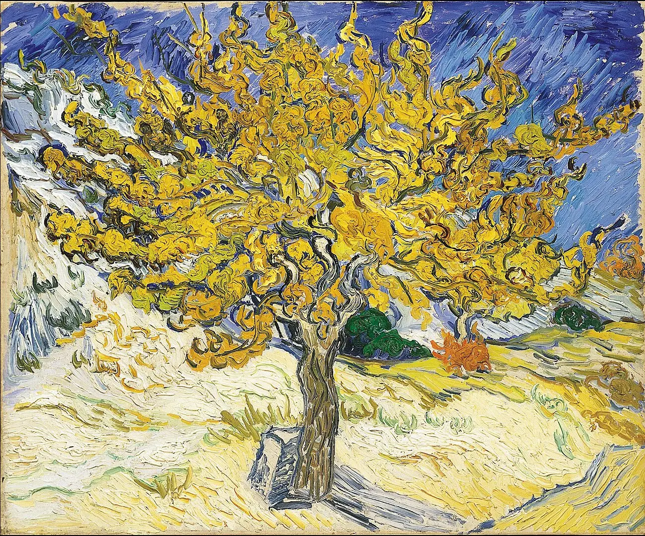
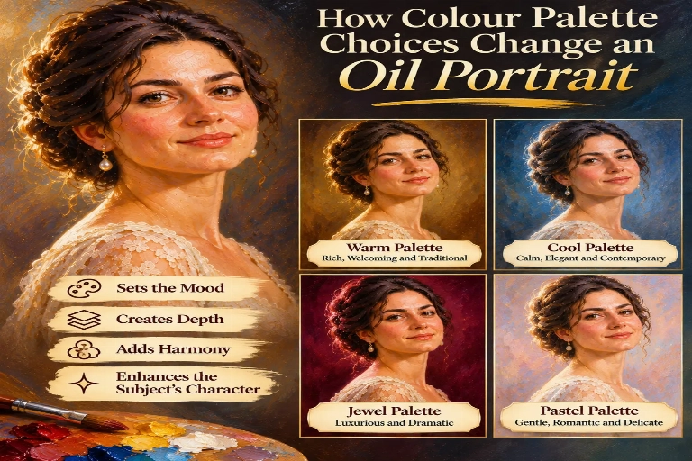
A palette of warm browns, ochres and golden tones can create a traditional and welcoming appearance. Cool blues, greys and muted greens may produce a calmer, more contemporary atmosphere. Rich burgundy, deep green and earthy colours can introduce elegance and sophistication, while softer pastel shades can give a portrait a gentle and delicate quality.
Whether you are commissioning an individual portrait, a family painting, a wedding portrait or a memorial painting, understanding colour choices can help you communicate the artistic direction you prefer. This guide explores how different colour palettes influence an oil portrait and how to select colours that complement the subject and intended composition.
Colour palette choices influence the mood, atmosphere, depth and visual harmony of an oil portrait. Warm colours can create a welcoming and traditional appearance, while cool colours can produce a calm and restrained effect. The relationship between the subject's skin tones, clothing and background also determines how balanced and expressive the finished painting feels.
The best colour palette depends on the subject, clothing, background and artistic style. Earthy browns, ochres and warm neutrals are popular for traditional portraits, while blues, greys and muted greens can suit contemporary compositions. A successful palette balances the colours of the face, clothing and surroundings without distracting from the subject.
Yes. You can discuss your preferred colours and overall atmosphere when planning a commissioned portrait. Reference photographs, clothing choices and background preferences can help establish a suitable palette. The artist can then interpret these colours to create a harmonious composition while preserving the subject's natural appearance.
Colour is more than a decorative feature in portrait painting. It helps communicate emotion, establish visual relationships and create a sense of depth. Even when the composition and subject remain unchanged, altering the colour palette can make the portrait feel entirely different.
For example, a portrait painted with warm golden tones may feel intimate, traditional and welcoming. The same subject represented with cool grey and blue tones may appear more restrained, reflective or contemporary.
Colour also helps connect different parts of the painting. The subject's skin tones, clothing, hair and background need to work together so that the composition feels unified.
In oil painting, colours can be layered, blended and adjusted to create subtle transitions. This makes the medium particularly suitable for developing complex skin tones, rich fabrics and atmospheric backgrounds.
Warm colour palettes use colours associated with sunlight, fire and earthy materials. They often include golden yellow, ochre, burnt sienna, terracotta, warm brown and red.
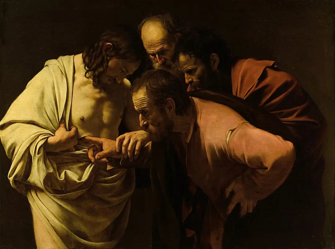
These colours can create a welcoming and traditional atmosphere, particularly when used alongside softly illuminated faces and darker backgrounds.
Warm palettes are particularly suitable for traditional family portraits, heritage paintings, formal commissions and portraits intended to create a sense of warmth and familiarity.
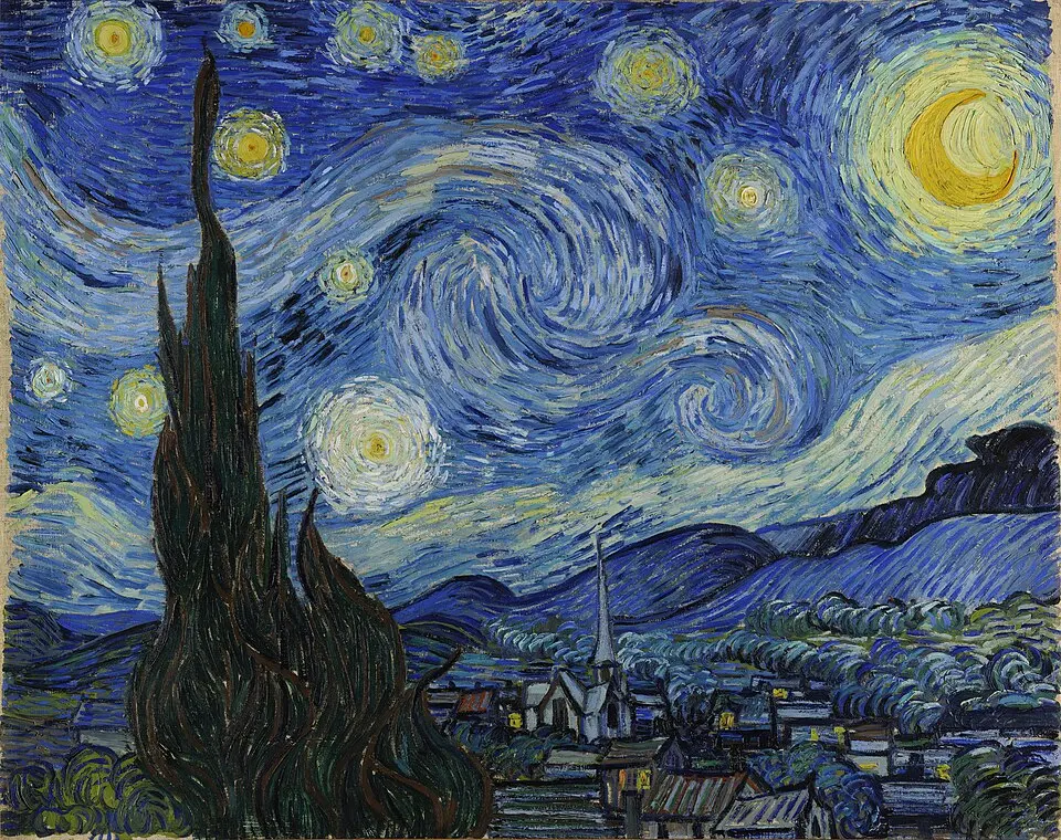
Cool palettes include blues, blue-greys, muted greens, cooler violets and selected neutral tones. They can create a calm and sophisticated atmosphere while giving a portrait a more restrained appearance.
Cool palettes can work particularly well for contemporary portraits, professional commissions and paintings featuring neutral or blue-toned clothing.
However, cool colours should be balanced carefully with the subject's natural skin tones. A portrait can appear lifeless if the face becomes excessively cool or loses its natural warmth.
Earthy palettes use colours inspired by natural materials such as soil, stone, wood and vegetation. They commonly include muted browns, ochres, olive greens, warm greys and subdued reds.
These colours are particularly effective in traditional oil portraiture because they can create a harmonious relationship between the subject and the background.
Earthy palettes are suitable for heritage portraits, multi-generation family paintings, individual commissions and traditional oil portraits.
A monochromatic palette is based on different shades, tints and tones of a single colour. Rather than using many contrasting colours, the artist develops visual interest through variations in lightness, darkness and saturation.
For example, a portrait may use several shades of blue, brown or grey. These variations can create depth while maintaining a consistent visual identity.
Although monochromatic paintings use a limited colour range, they still require careful tonal variation. The face must retain enough contrast and colour information to appear dimensional and recognisable.
Pastel palettes use lighter, less saturated versions of colours such as pink, blue, lavender, mint green, peach and cream.
They can create a gentle and delicate atmosphere, making them particularly suitable for children's portraits, romantic compositions and paintings where a softer visual effect is preferred.
Pastel colours can also work well in light backgrounds and contemporary interiors. However, sufficient contrast is still needed to ensure that the subject remains clearly defined.
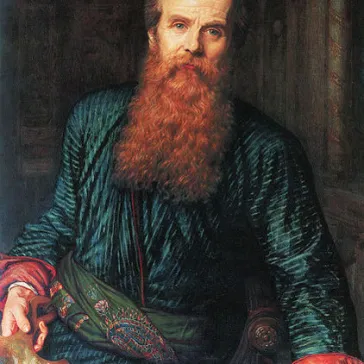
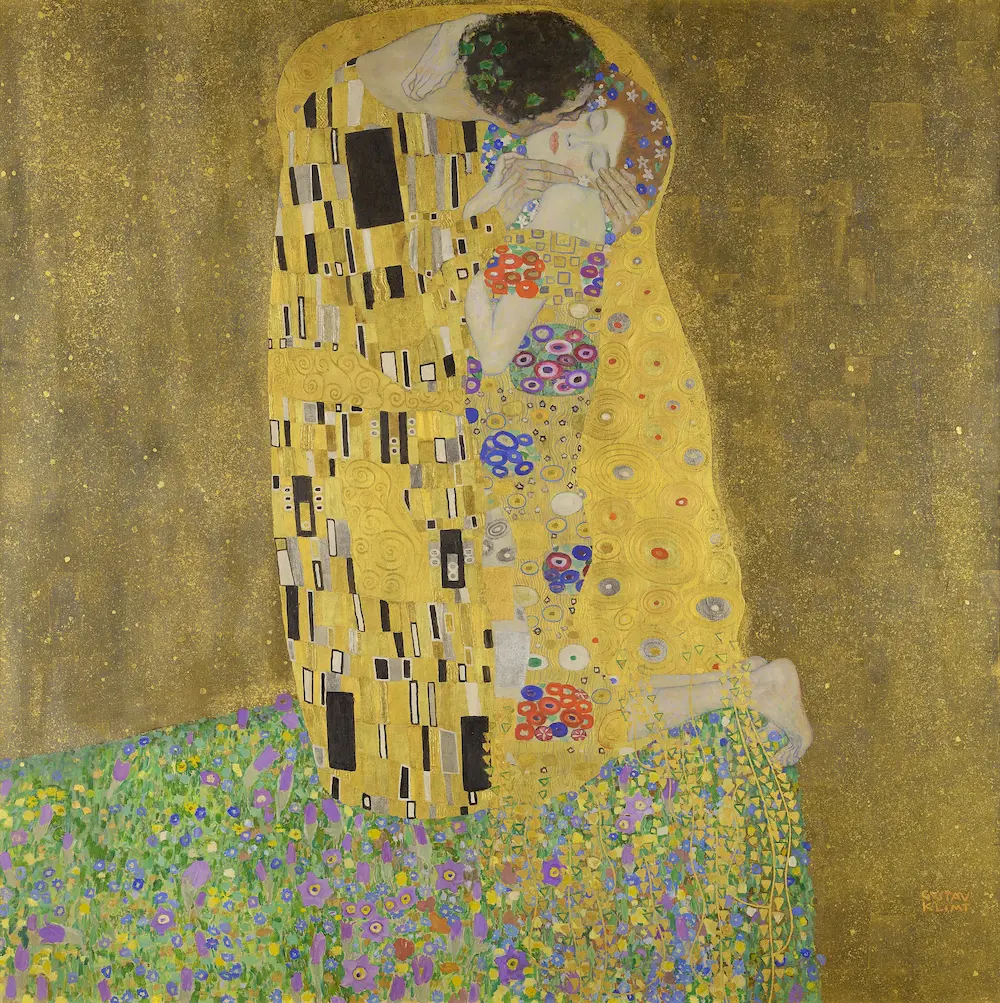
Rich colour palettes use deep, saturated colours such as burgundy, emerald green, sapphire blue, ruby red and deep violet. These colours can introduce visual richness and a sense of formality.
They are often effective when the portrait includes luxurious fabrics, traditional clothing, jewellery or a dark background.
Examples include:
Rich palettes are particularly suitable for formal portraits, ceremonial clothing, heritage commissions and paintings intended to have a strong visual presence.
Colour theory helps artists understand how colours relate to one another and how different combinations influence a painting.
Several principles are particularly relevant to oil portraiture.
Complementary colours sit opposite each other on the traditional colour wheel. Examples include blue and orange, red and green, and yellow and violet.
When used carefully, complementary colours can create visual contrast and help certain elements stand out. For example, a warm background may complement cooler clothing, or a blue setting may provide contrast against warm skin tones.
Analogous colours sit close together on the colour wheel. Examples include blue, blue-green and green, or red, red-orange and orange.
These combinations can create harmony because the colours share similar characteristics. They are useful when the aim is to create a cohesive and understated portrait.
Colours are often described as warm or cool. Warm colours can create a sense of closeness and energy, while cool colours may suggest calmness and distance.
Artists can combine warm and cool colours within the same painting to create visual interest. For example, warmer highlights on the face can be balanced by cooler shadows and a muted background.
Saturation refers to the intensity or purity of a colour. Highly saturated colours are vivid and strong, while less saturated colours appear muted.
A portrait with restrained saturation can feel subtle and traditional, while carefully selected vivid colours can create a more expressive and contemporary appearance.
Skin tones are among the most important colour relationships in portrait painting. They are not simply one colour but contain subtle variations influenced by lighting, surrounding colours and the natural characteristics of the subject.
Warm and cool colours may both appear within the same face. Highlights, midtones and shadows can contain different colour relationships while maintaining a convincing overall appearance.
Warm reds, ochres, peaches and golden tones may be used to represent areas receiving warm illumination. These colours can help create a healthy and natural appearance when balanced appropriately.
Muted blues, violets and cooler greys may contribute to shadow areas. They can create depth and help distinguish illuminated areas from parts of the face turned away from the light.
The chosen palette should enhance the subject rather than distort their appearance. The artist needs to consider the original reference photographs and retain the important tonal and colour characteristics of the individual's face.
This is particularly important when commissioning portraits of several family members, as each person's natural colouring needs to be represented within the same overall composition.
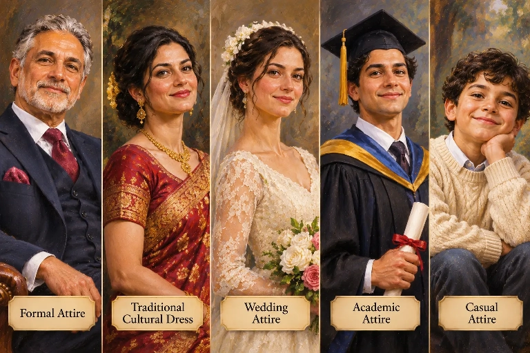
Clothing is a major part of the colour composition. A brightly coloured garment can become an important visual feature, while neutral clothing may allow the face to remain the main focal point.
When selecting clothing for a portrait, consider how the garment will interact with the background and skin tones.
For family portraits, coordinating colours can help establish visual harmony without requiring every person to wear matching clothing.
The background plays an important role in establishing the atmosphere of an oil portrait. It can either provide a subtle setting that allows the subject to stand out or introduce a more distinctive colour relationship.
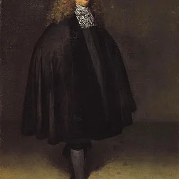
Warm brown, ochre, terracotta and muted gold can create a traditional and welcoming atmosphere. They often work well with classical portrait compositions.
Blue, grey and muted green can create a calm and contemporary appearance. They may also provide useful contrast against warm skin tones.
Charcoal, deep brown, burgundy and dark green can create depth and drama. They are particularly effective when the subject is illuminated against a darker setting.
Cream, ivory, pale grey and soft pastel shades can create an open and gentle atmosphere. They are often suitable for family portraits, children's paintings and contemporary interiors.
The background and clothing should be considered together. Strong colours can work beautifully, but the overall composition needs sufficient contrast and balance.
The most suitable palette depends on the subject, the purpose of the painting and the artistic atmosphere you want to achieve.
Individual portraits can use a wide range of palettes. Earthy and warm colours are suitable for traditional compositions, while cooler or monochromatic palettes can create a more contemporary appearance.
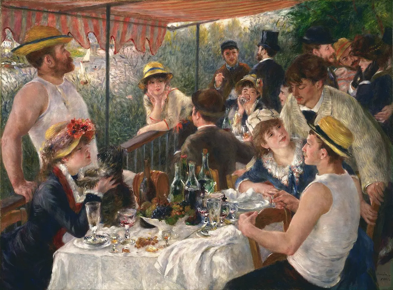
Family portraits often benefit from coordinated colours that help connect the different subjects. Muted blues, warm neutrals, soft greens and earthy tones can create a harmonious group composition.
Pastel colours and gentle warm tones can create a soft and welcoming appearance. Brighter colours may also be suitable when they reflect the child's personality or clothing.
Romantic palettes may include warm ivory, soft gold, muted rose, burgundy and complementary neutral colours. These can create an elegant atmosphere while allowing the clothing and expressions to remain prominent.
Heritage portraits may benefit from earthy colours, traditional fabric tones and richer palettes that complement cultural clothing and family history. The colour choices can help create a sense of continuity and timelessness.
Professional portraits often use restrained palettes such as navy, charcoal, muted blue, cream and warm grey. These colours can create a polished appearance without distracting from the subject.
Animal portraits can benefit from palettes that complement the animal's coat and surrounding environment. Earthy greens and browns may suit countryside settings, while carefully selected warm or cool backgrounds can help the animal stand out.
Yes. A hand-painted oil portrait does not necessarily need to reproduce every colour in the original photograph exactly.
The photograph provides a reference for the subject's appearance, but the artist can interpret the colour relationships to create a more harmonious painting.
For example, a portrait taken in an environment with distracting colours could be developed using a more restrained background. A photograph with cool lighting might inspire a warmer interpretation, provided the subject's natural appearance is preserved.
You can also provide separate reference images showing the colours, clothing or atmosphere you prefer. These can help communicate the intended artistic direction.
Before commissioning an oil portrait, consider the overall atmosphere you want the finished painting to create.
Ask yourself:
These considerations can help establish a clear artistic direction before the painting begins.
Colour choices can strengthen an oil portrait, but certain combinations may make the composition less harmonious.
A successful colour palette creates visual harmony while allowing the subject's individuality to remain the main focus.
Colour is one of the most influential elements in an oil portrait. It shapes the atmosphere, establishes visual harmony and helps communicate the personality and character of the subject.
Warm earthy colours can create a traditional and welcoming appearance, while cool palettes may introduce calmness and contemporary elegance. Rich jewel tones can add depth and sophistication, and pastel colours can create a softer and more delicate effect.
The most successful palette considers the relationship between skin tones, clothing, lighting and background. By planning these elements together, you can help create a portrait that feels balanced, personal and visually compelling.
When commissioning a hand-painted oil portrait, choosing the right colour palette is an opportunity to influence not only how the painting looks but also how it makes you feel.
At GFM Painting, a personalised oil portrait can be developed around your chosen photographs and artistic preferences. Whether you prefer warm traditional colours, cool contemporary tones or a rich and expressive palette, thoughtful planning helps create a painting that reflects the subject's individuality.
Explore the possibilities of a hand-painted oil portrait and create a meaningful work of art for yourself or someone special.
Websites Built to Grow Your Business
Professional Web Design • Development • SEO • Digital Marketing
Read More
Discover a different perspective on wealth, stewardship, purpose and leadership.
Read MoreColour is one of the defining elements of a successful oil portrait. It influences the atmosphere, visual balance and emotional character of the finished painting.
Warm earthy tones can create a traditional and welcoming appearance, while cool blues and muted greens introduce calmness and contemporary elegance. Rich jewel colours can add depth and sophistication, whereas soft pastel shades create a more delicate atmosphere.
The relationship between skin tones, clothing and background is particularly important. Carefully balanced colours help the subject remain the focal point while creating a harmonious composition.
For a commissioned portrait, the colour palette can be influenced by personal preferences, cultural clothing, meaningful colours and the intended artistic style. It does not need to reproduce the original photograph exactly.
Ultimately, a thoughtful colour palette brings the different elements of an oil portrait together, helping create a distinctive and lasting work of art.
Frequently Asked Questions
Warm, earthy colours such as burnt sienna, yellow ochre, raw umber and muted gold are popular choices for traditional oil portraits. They can create a rich, timeless appearance and complement classical backgrounds.
Yes. You can discuss your preferred colours with the artist before the painting begins. You might choose colours that complement the subject's clothing, reflect cultural heritage or create a particular atmosphere. Reference images can help communicate your preferences.
Yes. Warm colours such as gold, ochre and terracotta can create a welcoming and intimate atmosphere. Cool colours such as blue, grey and muted green can produce a calmer, more contemporary appearance. Both can be combined to create visual balance.
Yes. The background colours can be interpreted differently from the original photograph. For example, a busy or brightly coloured setting could be replaced with a softer neutral background or a darker classical palette that brings greater attention to the subject.
Not necessarily. Coordinating colours can create harmony without requiring everyone to wear identical outfits. Complementary shades such as navy, cream, soft blue and earthy neutrals can help bring the composition together while preserving each family member's individuality.

GFM Designer Ltd
Maultway Court
67-69 Ruxley Lane
Epsom, Surrey
KT19 0JG. UK

E-MAIL : info@gfmpainting.co.uk
PHONE : +44 (0) 203 592 3482
MOBILE : +44(0) 7834 393 396