Your favourites are only temporarily saved. To find them back, create your account on GFM Painting!
Already have account ?
No gift cards in your cart.
November 13, 2026


Colour is one of the most important elements in still life painting. Although the genre often focuses on familiar objects such as flowers, fruit, ceramics, glassware and everyday possessions, artists use colour to transform these subjects into expressive compositions. Through the careful arrangement of warm and cool tones, subtle contrasts, light and shadow, colour can communicate beauty, abundance, memory and the passage of time.
From the rich colours of Dutch Golden Age paintings to the bold experiments of modern artists such as Paul Cézanne and Henri Matisse, colour has played a central role in the development of still life as an artistic genre. Understanding how artists use colour reveals how ordinary objects can become meaningful works of art.
Colour communicates mood, atmosphere, symbolism and the character of objects in still life painting. Artists use colour to create visual harmony, establish contrast and suggest deeper meanings associated with everyday subjects.
Artists create harmony by combining complementary, analogous, warm and cool colours. They carefully balance the colours of objects, backgrounds and surrounding surfaces to establish visual unity while using contrast to guide the viewer's attention.
Colour helps artists represent the appearance, texture and individuality of everyday objects while communicating ideas beyond their physical form. It can make a simple arrangement of flowers, fruit or household possessions visually engaging and emotionally meaningful.
Still life painting offers artists an opportunity to explore the visual qualities of objects that are often overlooked in everyday life. A bowl of fruit, a vase of flowers or a collection of household possessions can become the subject of a carefully constructed artistic composition.
Colour is central to this process. It allows artists to distinguish between different materials, represent the effects of natural light and create relationships between objects. A bright red apple against a muted background, for example, can immediately attract attention, while delicate tonal variations in a porcelain vase can suggest its smooth surface and reflective qualities.
However, colour in still life painting is not simply about reproducing what the artist sees. It can also communicate symbolism and personal interpretation. Flowers may suggest beauty or the passing of time, fruit can represent abundance, and objects associated with wealth or everyday life may reveal something about the society in which a painting was created.
Across different periods of art history, artists have developed distinctive approaches to colour. Dutch Golden Age painters explored realistic surfaces and rich tonal contrasts, while later artists such as Cézanne and Matisse used colour more experimentally to investigate form, structure and artistic expression.
One of the fundamental purposes of colour in still life painting is to establish the identity and character of individual objects. Artists observe how colour changes according to the material, surface, lighting and surrounding environment.
A painting featuring fruit, flowers, glassware and ceramics presents several different colour challenges. Each object has its own visual qualities, and the artist must consider how these differences can be represented convincingly.
Colour also helps distinguish objects that might otherwise appear visually similar. A green pear, a red apple and a yellow lemon can be arranged together to create a composition with natural variety and contrast.
Artists may also exaggerate or simplify the colours of objects. Rather than reproducing every detail exactly, they can emphasise particular colours to strengthen the composition or communicate a personal interpretation of the subject.
Through these decisions, ordinary objects become more than simple representations of everyday life. They become opportunities to explore colour, form, texture and artistic expression.
The relationship between warm and cool colours is an important part of still life composition. Artists use these colour groups to establish atmosphere, create visual balance and influence how viewers experience a painting.
Warm colours include reds, oranges and yellows. They can create a sense of richness, energy, warmth and visual intensity. Cool colours, including blues, greens and many violets, can suggest calmness, freshness and visual distance.
When these colour groups are combined thoughtfully, they create contrast without necessarily disrupting the overall harmony of the painting.
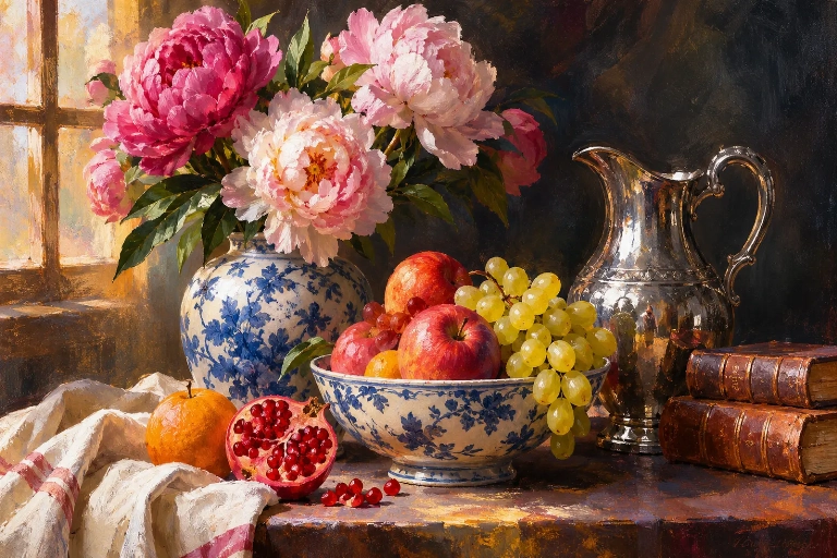
Warm colours are frequently associated with fruit, flowers and richly decorated objects. Deep reds, golden yellows and orange tones can give a still life composition a sense of abundance and warmth.
For example, a bowl of ripe fruit painted in warm colours against a darker background can create a strong focal point. The contrast helps the objects stand out while contributing to the overall atmosphere of the painting.
Cool colours can create a quieter and more restrained visual experience. Blues and greens are particularly effective in compositions featuring ceramics, glassware, foliage and cool-toned backgrounds.
Artists can also use cool colours to balance areas of intense warmth. A blue background behind yellow flowers, for instance, can make the flowers appear more vibrant while maintaining a sense of visual structure.
Artists use several approaches to establish colour harmony:
The successful use of these relationships allows artists to create compositions that feel balanced while retaining enough contrast to hold the viewer's attention.
Colour cannot be fully understood without considering light and shadow. The appearance of an object changes according to the direction, intensity and quality of the light falling upon it.
In still life painting, light helps reveal the physical qualities of objects. A glass bottle may reflect its surroundings, a silver vessel may contain bright highlights, and a piece of fruit may display subtle transitions between illuminated and shaded areas.
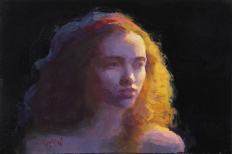
Natural light can transform the atmosphere of a still life composition. Soft daylight entering from a window may produce gentle shadows and delicate colour variations, while stronger directional light can create dramatic contrasts between illuminated objects and darker surroundings.
Artists often consider:
Different surfaces respond to light in different ways. The artist must use colour and tonal variation to suggest these physical characteristics.
For example, the glossy surface of an apple may require sharper highlights, while a piece of fabric may need softer transitions between light and shadow. A ceramic vase may combine smooth areas with reflective details, creating a more complex visual surface.
These distinctions are particularly important in traditional still life painting, where the careful observation of materials and light contributes to the realism and visual richness of the composition.
Shadows are not necessarily areas of simple black or grey. They can contain subtle colours influenced by surrounding objects, reflected light and the overall environment.
A blue object may cast a cooler-looking shadow, while a warm-coloured surface nearby can influence the appearance of the shadow through reflected light. Recognising these relationships helps artists create more convincing and visually integrated compositions.
Beyond its visual function, colour can communicate symbolic meaning in still life painting. Objects and their colours may represent ideas associated with nature, wealth, beauty, mortality and the passage of time.
Symbolism was particularly significant in Dutch Golden Age still life painting, where carefully arranged objects could communicate moral, religious and philosophical ideas.
Flowers are among the most recognisable subjects in still life art. Their colours can suggest beauty, vitality and the changing seasons. However, flowers can also remind viewers that beauty is temporary.
A vibrant bouquet may appear full of life, while a flower beginning to wilt can introduce a more reflective meaning. This contrast between freshness and decay became an important subject in many historical still life compositions.
Fruit is frequently used to represent prosperity, nourishment and the richness of nature. Its varied colours and textures also provide artists with opportunities to explore visual contrast.
However, fruit can also carry symbolic associations with temptation, temptation's consequences and the temporary nature of material pleasures, depending on the objects and historical context of the painting.
Vanitas still life paintings developed particularly within seventeenth-century Dutch and Flemish art. They often included objects such as skulls, extinguished candles, watches, books and decaying flowers.
These objects were arranged to remind viewers of mortality and the temporary nature of earthly achievements and possessions.
Colour played an important role in establishing the contrast between beauty and decay. Richly coloured flowers, polished objects and attractive arrangements could exist alongside symbols of death and the passage of time.
Through this combination, artists created compositions that were visually beautiful while also encouraging deeper reflection.
Colour is closely connected to composition. Artists use it to organise objects, establish focal points and guide the viewer's eye around a painting.
A still life arrangement may contain several objects with different shapes, sizes, textures and colours. Without careful organisation, these elements can compete for attention and weaken the overall composition.
Artists often use a dominant colour to establish the main point of interest. A bright flower, a bowl of fruit or a reflective object may attract attention through its colour contrast with the surrounding environment.
Other objects can be painted using more subdued colours so that the focal point remains visually prominent.
Colour can also guide the viewer from one part of a painting to another. Repeated colours across different objects help create visual connections and encourage the eye to move around the composition.
For example, a red apple, a red flower and a small decorative object may share similar tones. These repeated colours create unity while helping connect separate parts of the arrangement.
Artists consider the distribution of colour throughout the painting. A large area of intense colour on one side may need to be balanced by smaller areas of similar colour elsewhere.
Important compositional considerations include:
Through these decisions, colour becomes an important tool for creating structure and balance rather than simply decorating the objects within a painting.
Throughout art history, artists have developed distinctive approaches to colour in still life painting. Their choices reflect different artistic traditions, personal interests and changing ideas about representation.
During the seventeenth century, Dutch and Flemish artists developed highly detailed still life paintings featuring flowers, fruit, food, glassware and valuable household objects.
Artists such as Jan Davidsz. de Heem and Rachel Ruysch became known for their elaborate floral and still life compositions. Their paintings often featured rich colours, carefully observed textures and sophisticated arrangements.
Colour helped distinguish individual objects while contributing to the impression of luxury, abundance and natural detail. In some works, symbolic objects also encouraged viewers to consider the temporary nature of beauty and material wealth.
Paul Cézanne transformed the approach to still life by using colour to investigate the structure and form of objects. His paintings of apples, pears, bottles and table arrangements demonstrate how colour can help construct volume and spatial relationships.
Rather than relying exclusively on traditional perspective and shading, Cézanne used carefully placed patches of colour to build the appearance of form. His approach influenced later developments in modern art, particularly the emergence of Cubism.
Henri Matisse explored a more expressive use of colour in his still life compositions. His paintings often feature bold colour combinations, simplified forms and decorative patterns.
He did not always attempt to reproduce the natural colours of objects. Instead, colour could be used independently to create atmosphere, rhythm and visual harmony.
Giorgio Morandi developed a distinctive approach through his paintings of bottles, jars and simple household objects. His restrained palette often included muted creams, greys, browns and soft variations of other colours.
Rather than relying on dramatic colour contrasts, Morandi explored subtle tonal relationships, spacing and the visual presence of everyday objects. His work demonstrates how a limited palette can create a powerful and contemplative artistic experience.
These artists reveal that there is no single correct way to use colour in still life painting. It can be employed to achieve realism, investigate structure, communicate emotion or create a distinctive personal style.
Colour gives still life painting much of its visual character and expressive potential. Through the careful representation of everyday objects, artists explore relationships between light, texture, form, composition and symbolism.
From the rich colours and detailed surfaces of Dutch Golden Age paintings to the structural experiments of Cézanne, the expressive palette of Matisse and the restrained compositions of Morandi, artists have continually reinterpreted the possibilities of colour.
Colour can make a simple arrangement of fruit appear abundant, transform flowers into reflections on beauty and time, or turn familiar household objects into carefully balanced artistic compositions. It can also reveal the individual vision of the artist, demonstrating that the same subject can be interpreted in many different ways.
Ultimately, still life painting reminds us that ordinary objects can hold extraordinary artistic possibilities. Through colour, artists invite us to look more closely at the familiar world and discover the beauty, meaning and emotion contained within everyday things.
Websites Built to Grow Your Business
Professional Web Design • Development • SEO • Digital Marketing
Read More
Discover a different perspective on wealth, stewardship, purpose and leadership.
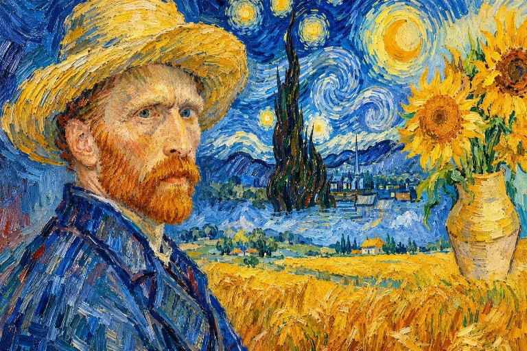
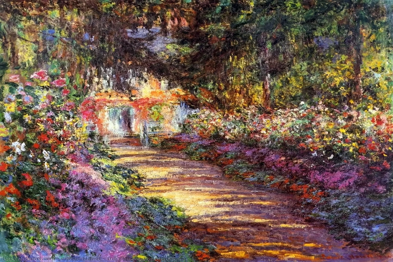
Read MoreColour gives still life painting its distinctive visual language. Through carefully arranged flowers, fruit, ceramics, glassware and everyday possessions, artists explore beauty, abundance, memory and the passage of time.
From the rich reds of ripe fruit to the delicate tones of fading flowers, colour can reveal the character of an object and the meaning behind its presence.
Artists such as Paul Cézanne, Henri Matisse, Giorgio Morandi and the Dutch Golden Age still-life painters used colour in remarkable ways to explore harmony, contrast, texture and artistic expression.
The relationship between colour, light, surface and symbolism can transform ordinary objects into compelling compositions filled with visual interest and deeper significance.
Discover how colour shapes the atmosphere, meaning and emotional impact of still life paintings, and why this enduring genre continues to inspire artists and collectors.
Frequently Asked Questions
Still life paintings can feature a wide range of colours, depending on the objects, lighting and artistic style. Reds, yellows, greens, blues and earthy tones are frequently used to represent fruit, flowers, ceramics and household objects.
Artists observe variations in colour, light and shadow to represent the shape, texture and surface of each object. Subtle highlights, tonal transitions and reflected colours help create a convincing sense of depth and realism.
Traditional still life painting often focuses on realistic representation, detailed textures and carefully controlled lighting. Modern approaches may use simplified forms, unconventional colour combinations and expressive brushwork to explore ideas beyond the appearance of objects.
Dark backgrounds can make brightly coloured objects appear more prominent and create a sense of depth. They also allow artists to control the viewer's attention and establish a dramatic atmosphere through the contrast between light and shadow.
Yes. Artists can use carefully selected objects, colours and arrangements to communicate ideas about wealth, nature, beauty, memory and mortality. For example, a vanitas painting may include fading flowers, extinguished candles or a skull to remind viewers of the passage of time and the temporary nature of life.

GFM Designer Ltd
Maultway Court
67-69 Ruxley Lane
Epsom, Surrey
KT19 0JG. UK

E-MAIL : info@gfmpainting.co.uk
PHONE : +44 (0) 203 592 3482
MOBILE : +44(0) 7834 393 396